United Kingdom (GBP)
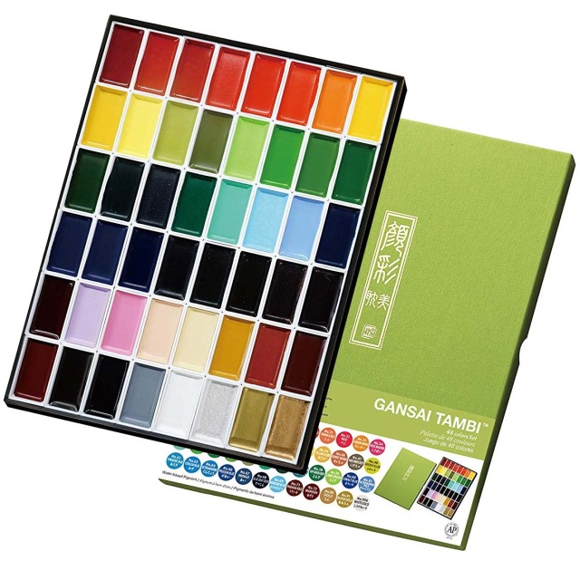
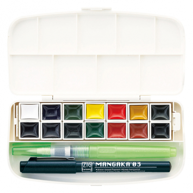
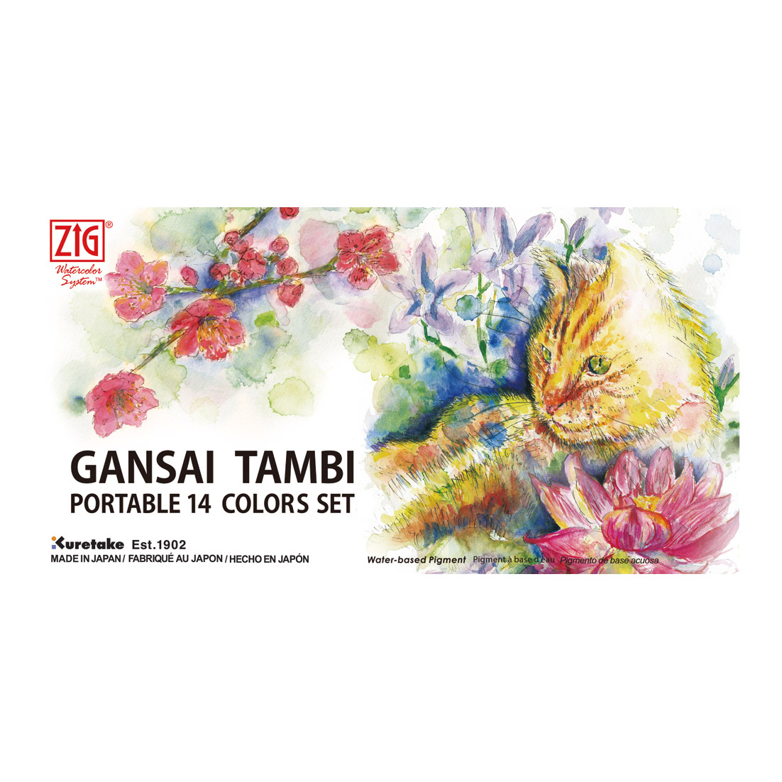
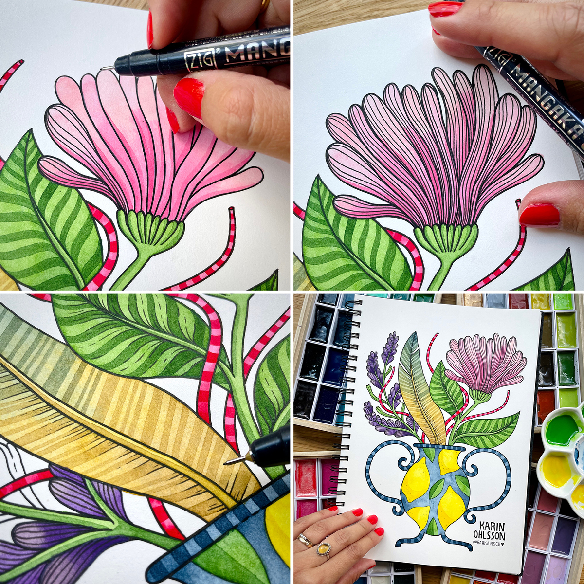
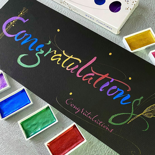
Illustrator Karin Ohlsson (Bahkadisch) is a frequent user of the Gansai Tambi watercolours from Zig Kuretake. We had the pleasure of following her step by step as she created her illustration, from sketch to finished piece. Below, Karin shares her process through both images and text, showing how the artwork came together and which products she used.

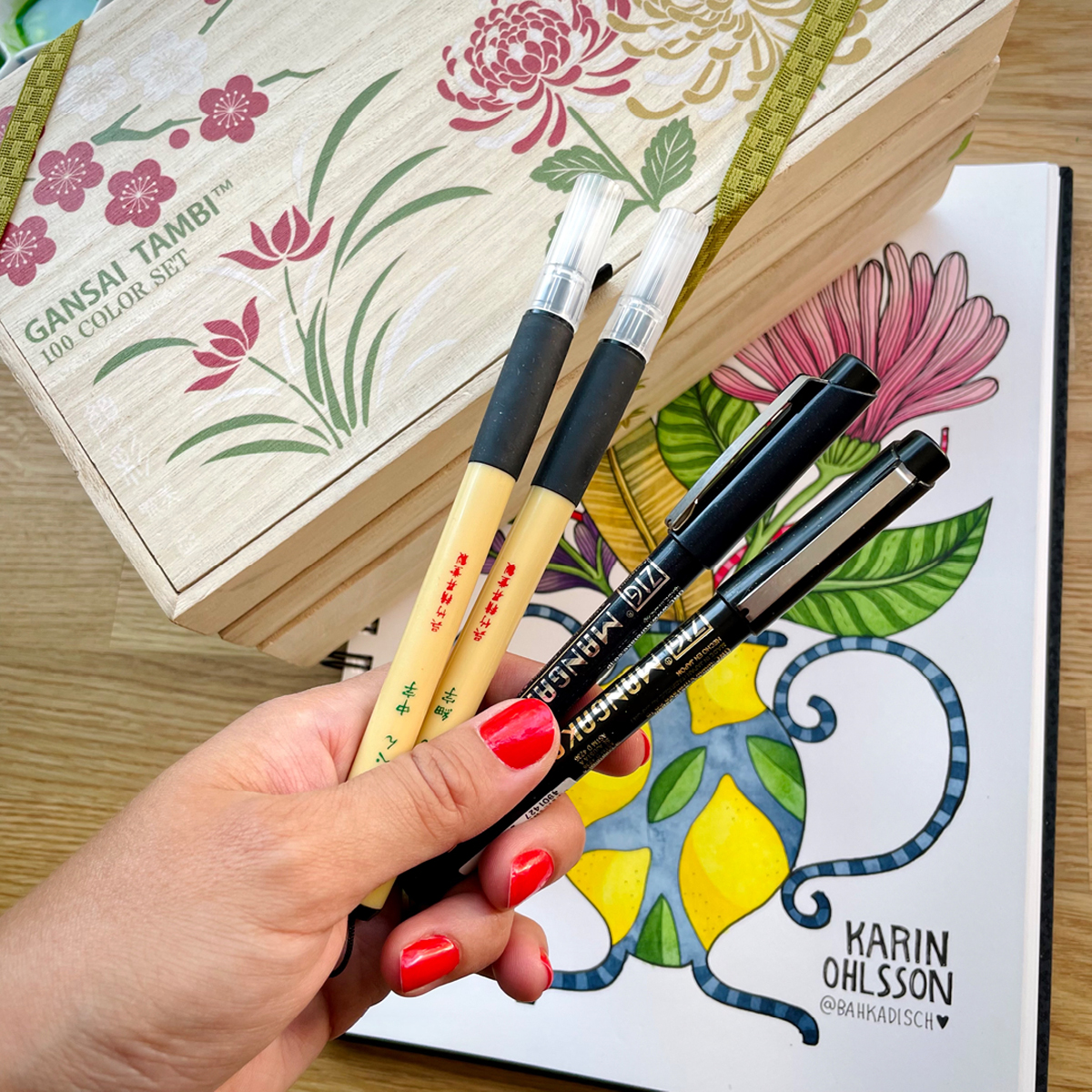
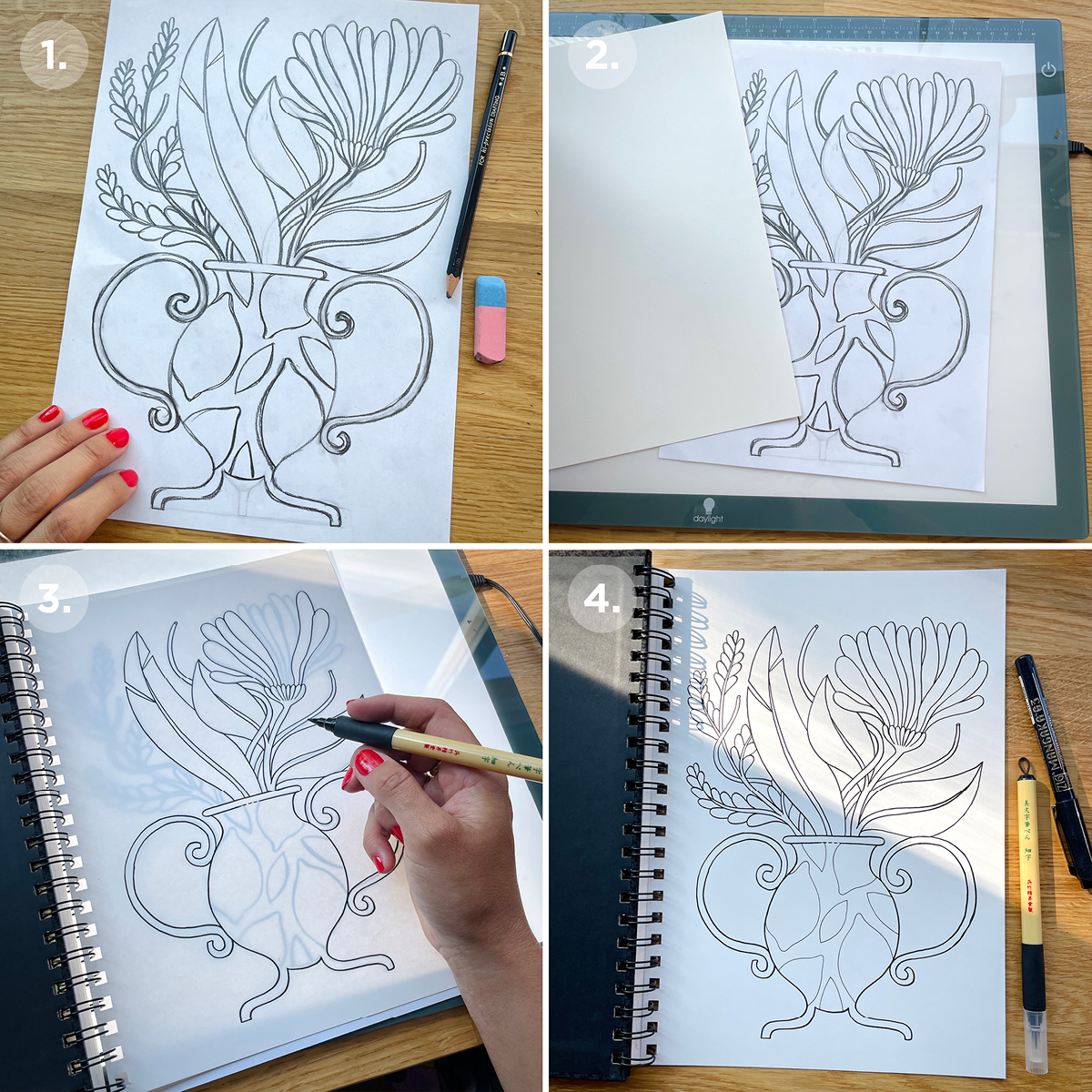
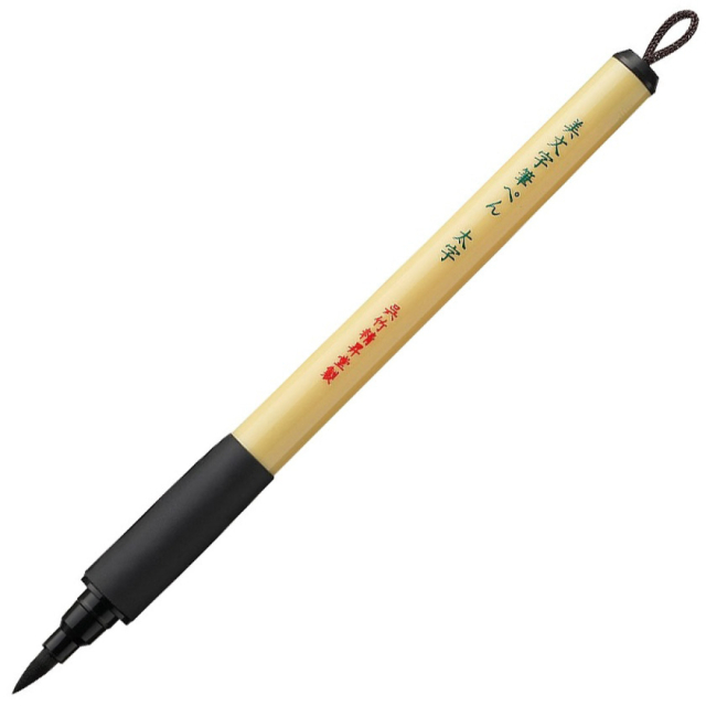
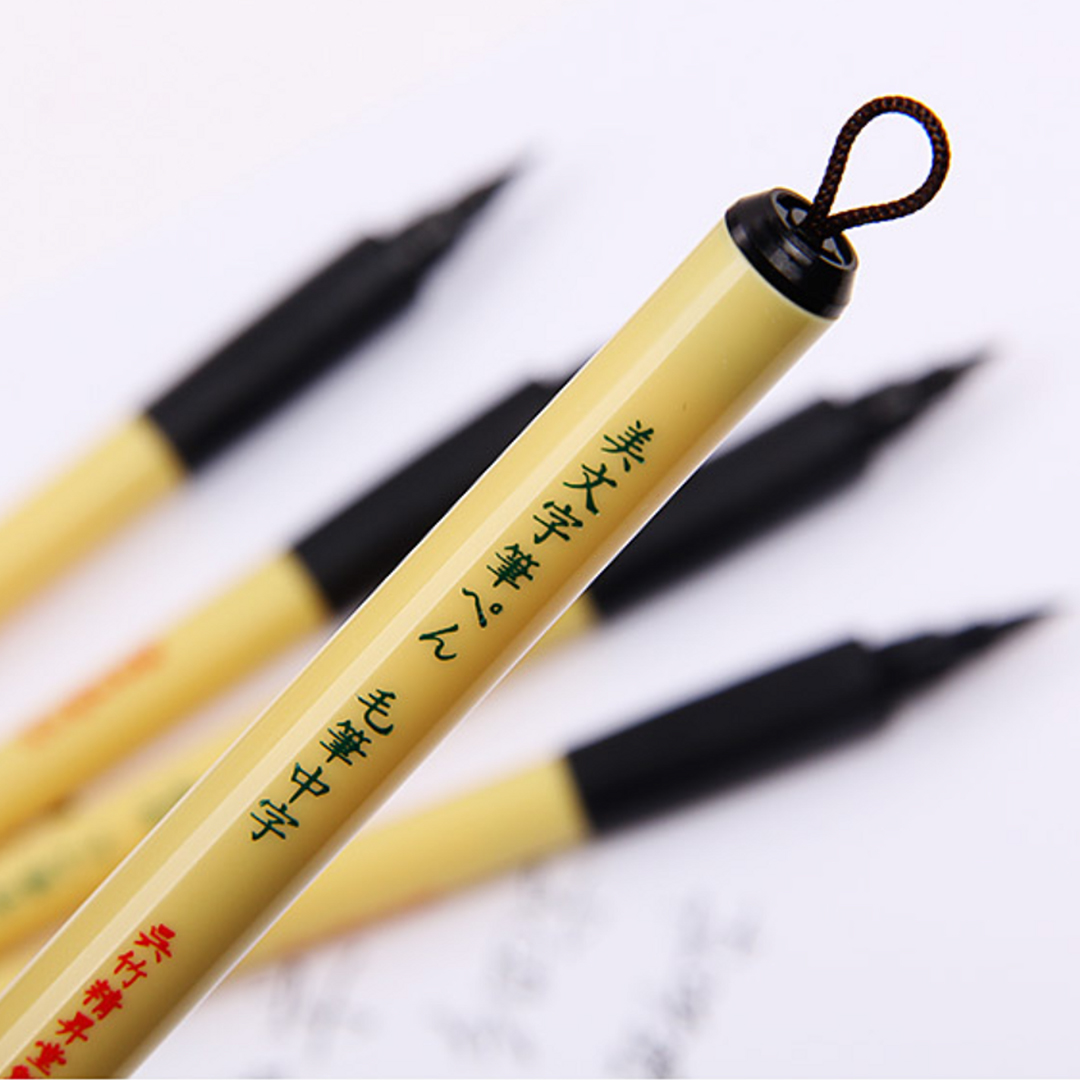
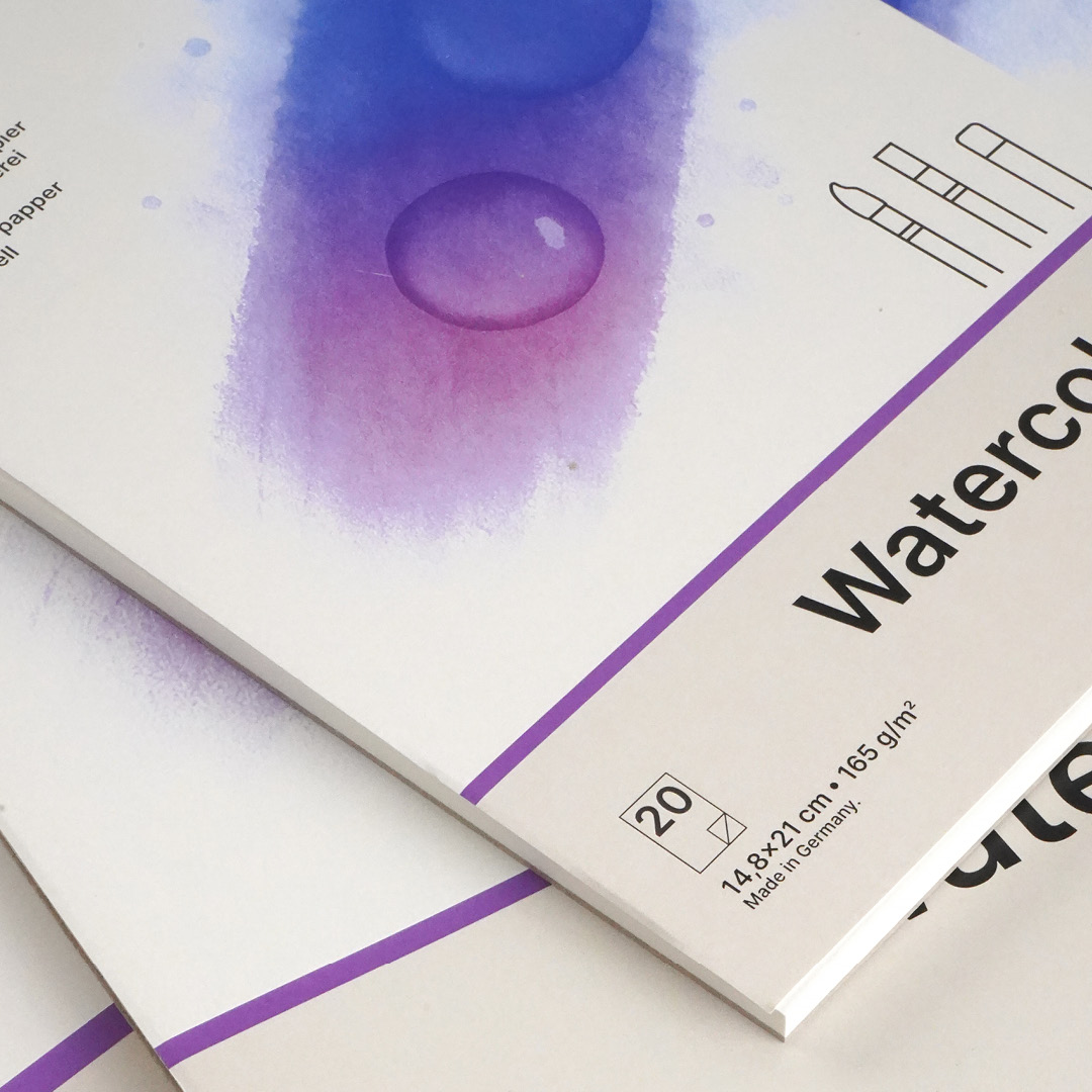
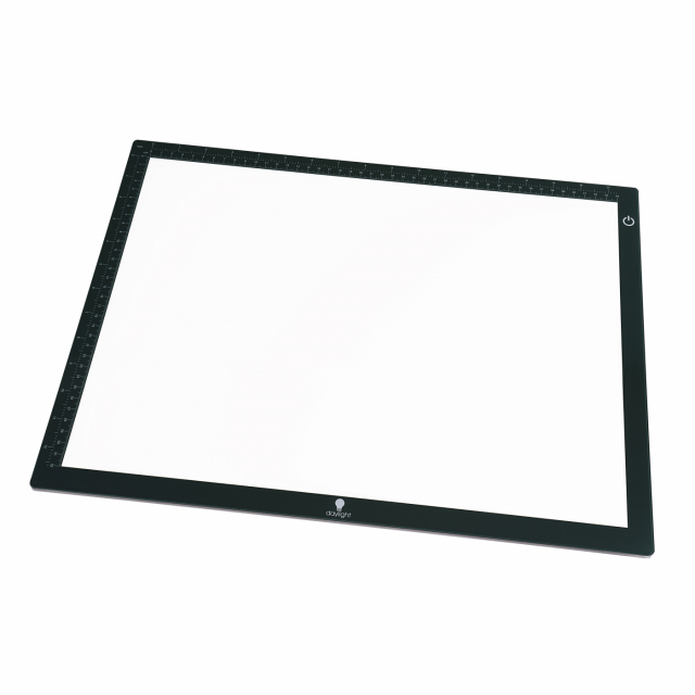
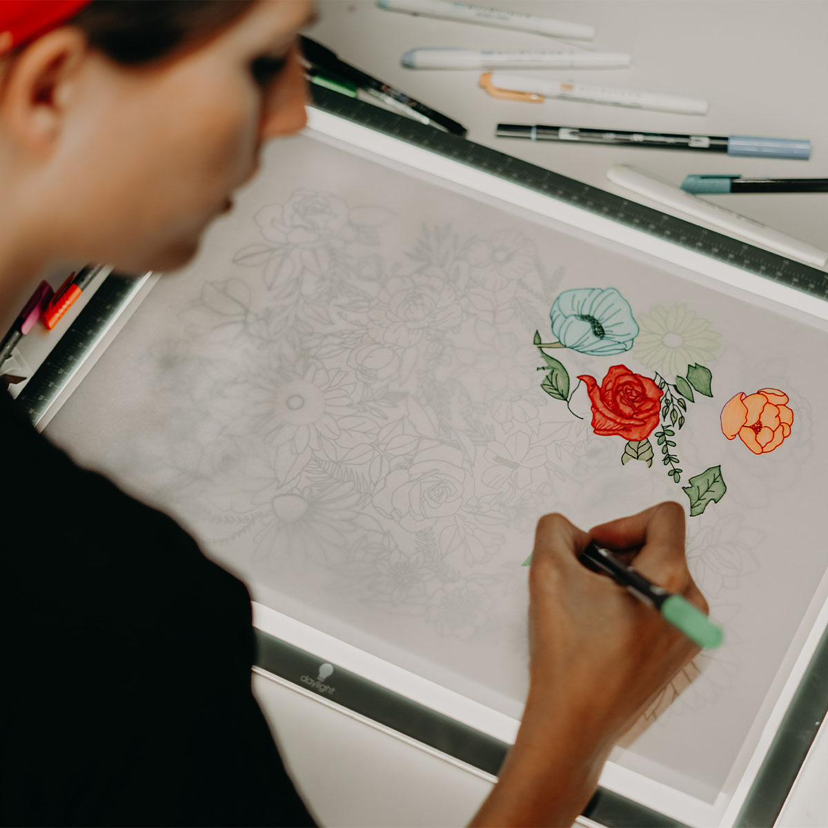
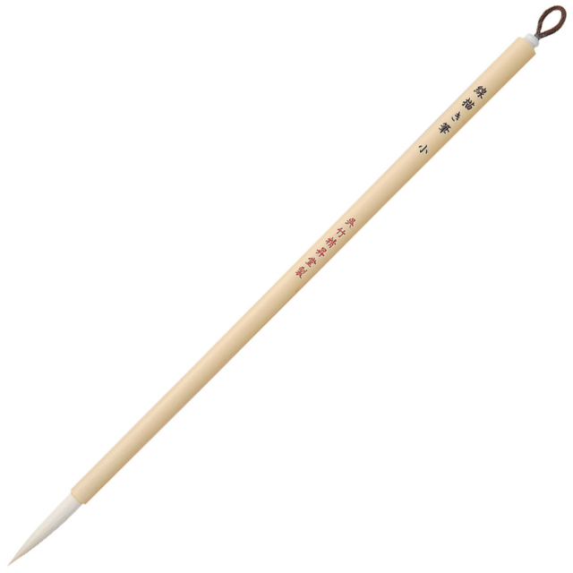
For this piece, I started with a sketch. Normally, I draw my black outlines directly onto the watercolour paper, but sometimes it’s nice to have a pencil sketch as a base. I make the sketch on a separate A4 sheet, then use a lightbox to transfer it onto my watercolour paper. The reason for this is that I prefer not to erase the pencil sketch once the black lines are finished. Here, I used a Kuretake Bimoji Fude Brush in the second smallest size, along with a Mangaka fineliner.
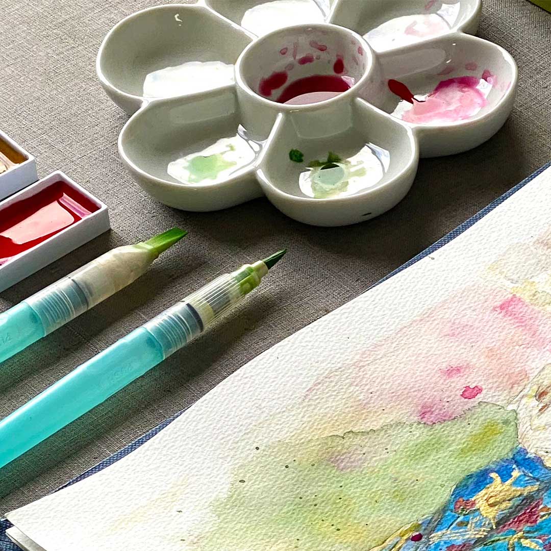
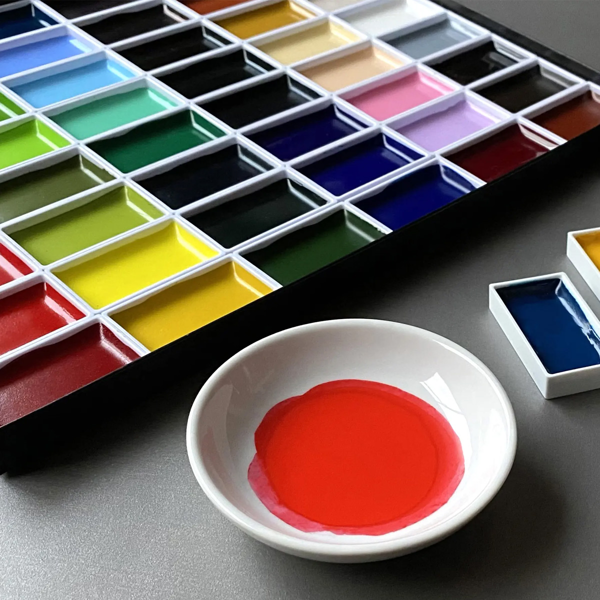
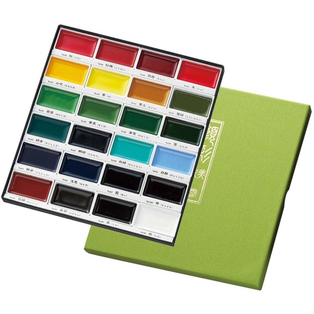
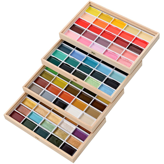
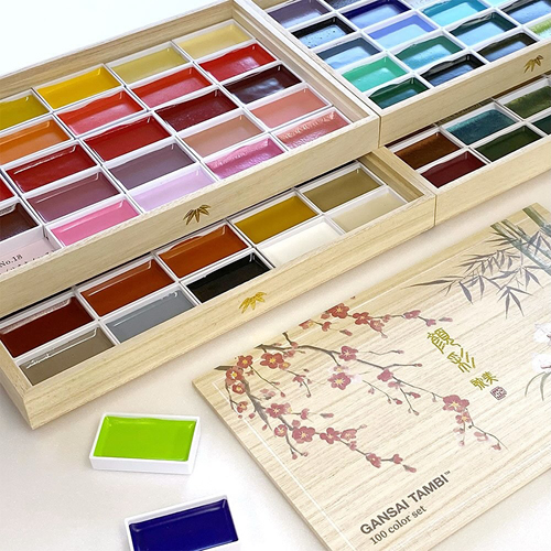
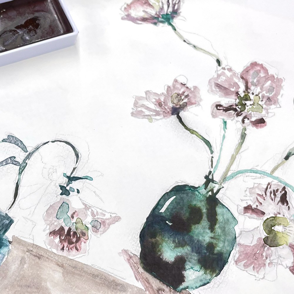
Once my outlines are in place, I bring out my wooden box of watercolours from Zig Kuretake. I’ve used it a lot and have found my favourite colours that I tend to stick with. Since there are 100 colours to choose from, I don’t usually mix them in a palette, instead I use them as they are and let them blend directly on the paper. For the leaves in this image, for example, I used Sap Green and Sap Green Deep. For the lemons, I used Cadmium Yellow and Aureolin. In the first layers, I work “wet on wet”. This means that the Sap Green should still be wet when I dab in a bit of Sap Green Deep to create variation in the green tones. The “wet on wet” technique allows the colours to flow into each other and create a gradient from one shade to the other.
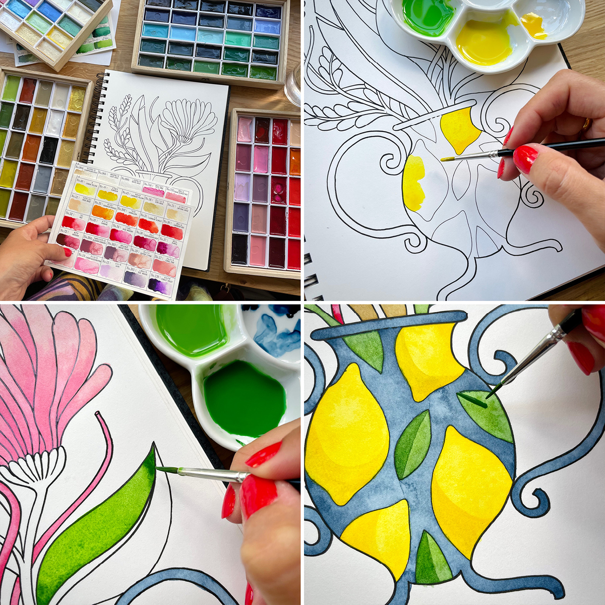
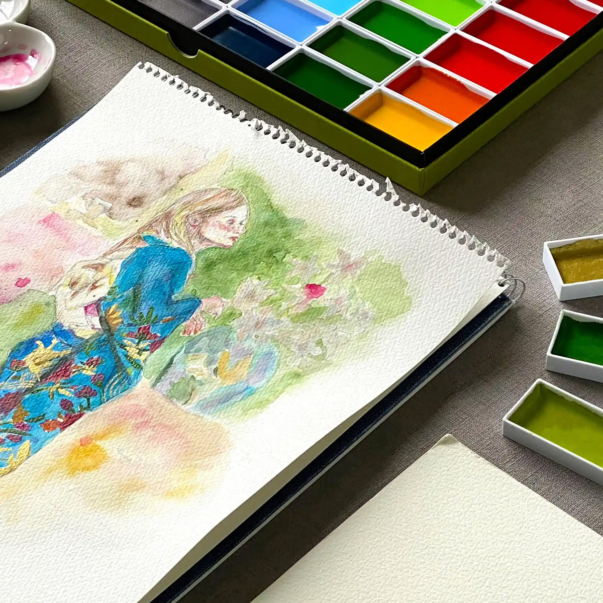

Once the first layer of paint has dried, I like to add another layer where I focus on different details. For example, I add blue stripes to the vase, darker areas on the feather, and green details on the leaf.
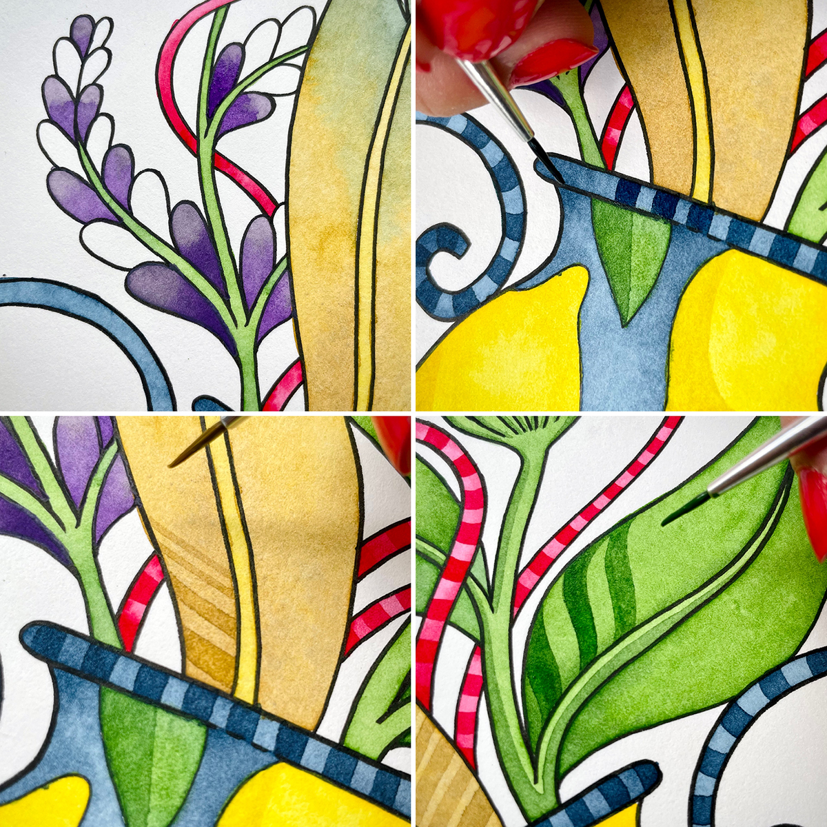
When I’m happy with how the watercolour looks, I go back to my fineliner. For me, this is probably the best part! I add black details on top of the watercolour. Once all the little black lines are in place, the illustration is finished!


ZIG Kuretake→
Watercolour →
Brushes →