United Kingdom (GBP)
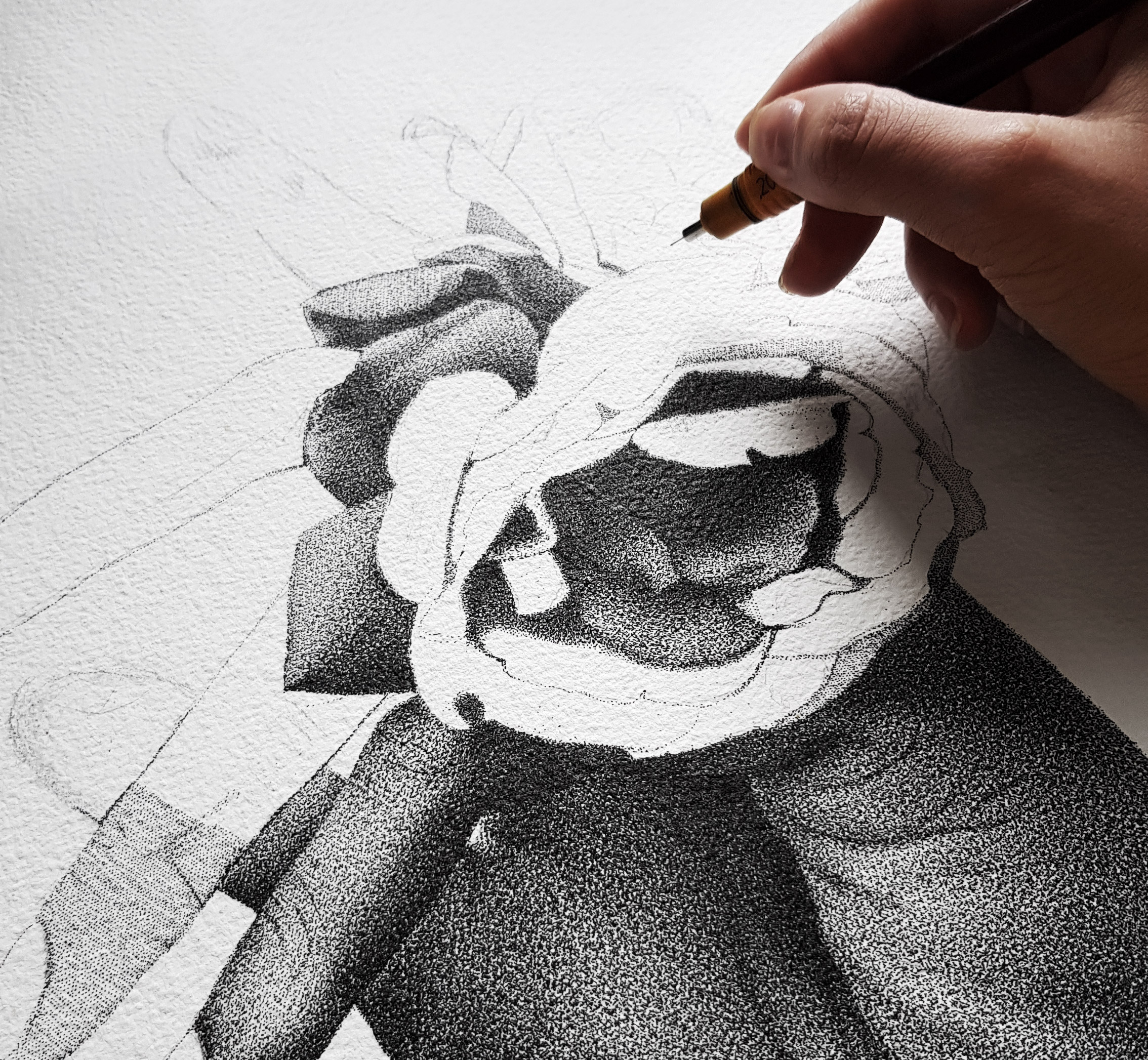
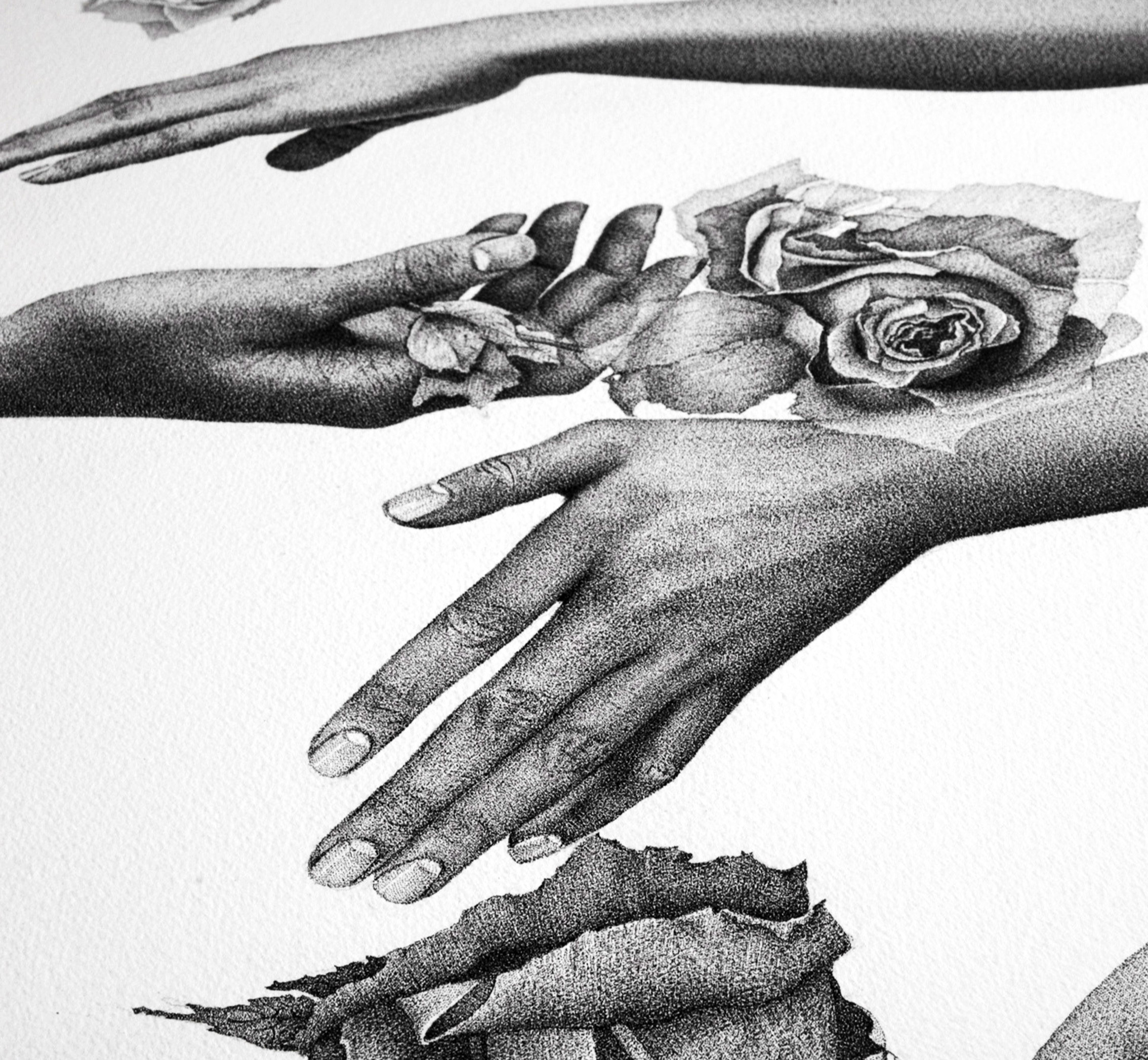
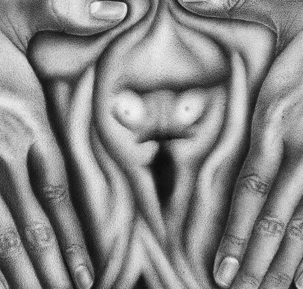
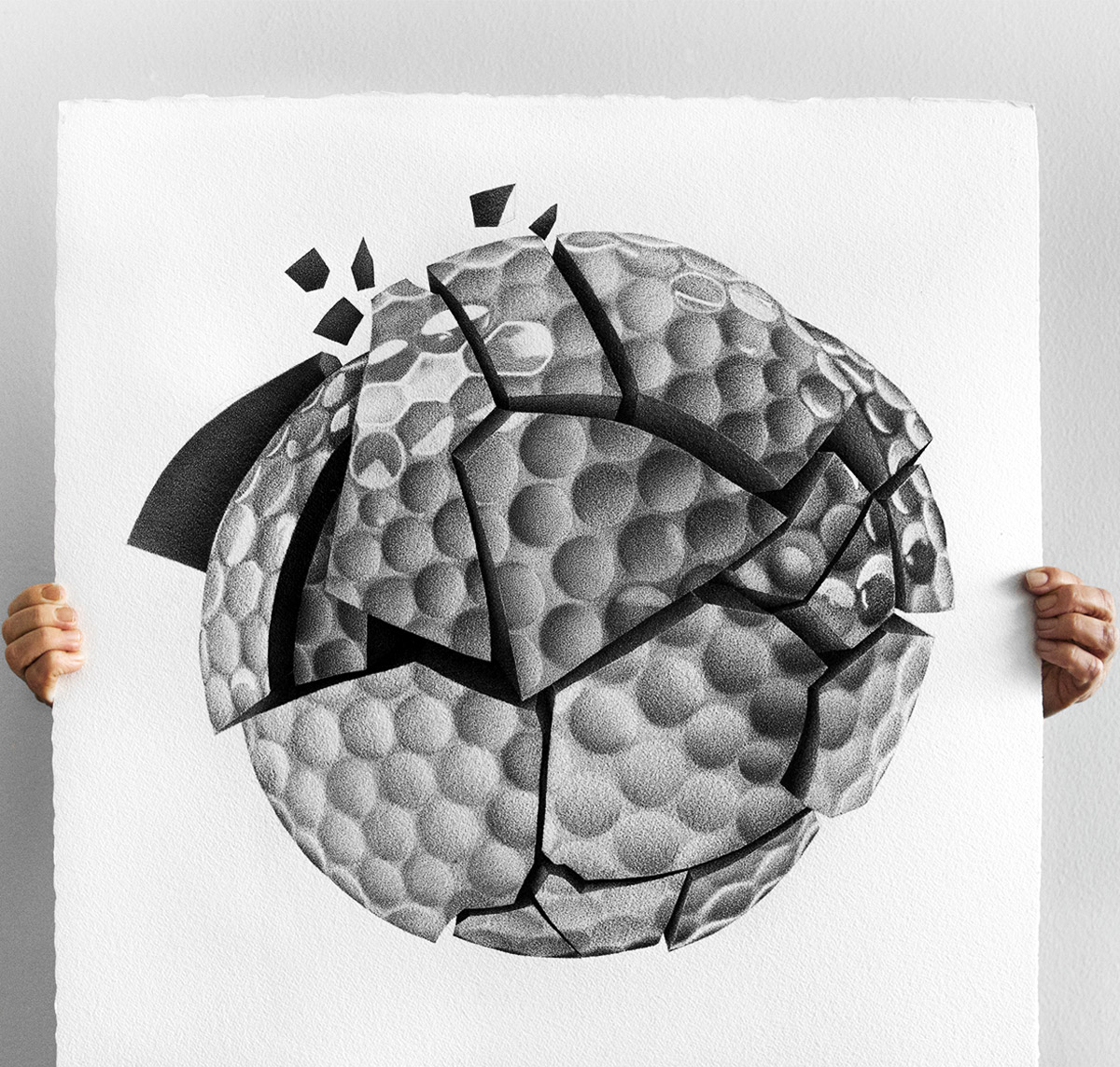
Stippling is a technique in which an image is built up using thousands of tiny dots, a patient yet powerful way to create shadows, highlights and depth in a drawing. In this article, you'll meet artist Julia Koceva, whose detailed and captivating works demonstrate just how vibrant this technique can be. She shares her best tips, explains her step-by-step process, and discusses which materials work best. A perfect introduction for anyone curious about getting started with stippling or looking to be inspired by someone who truly masters the potential of the dot.
Julia, what materials do you use?
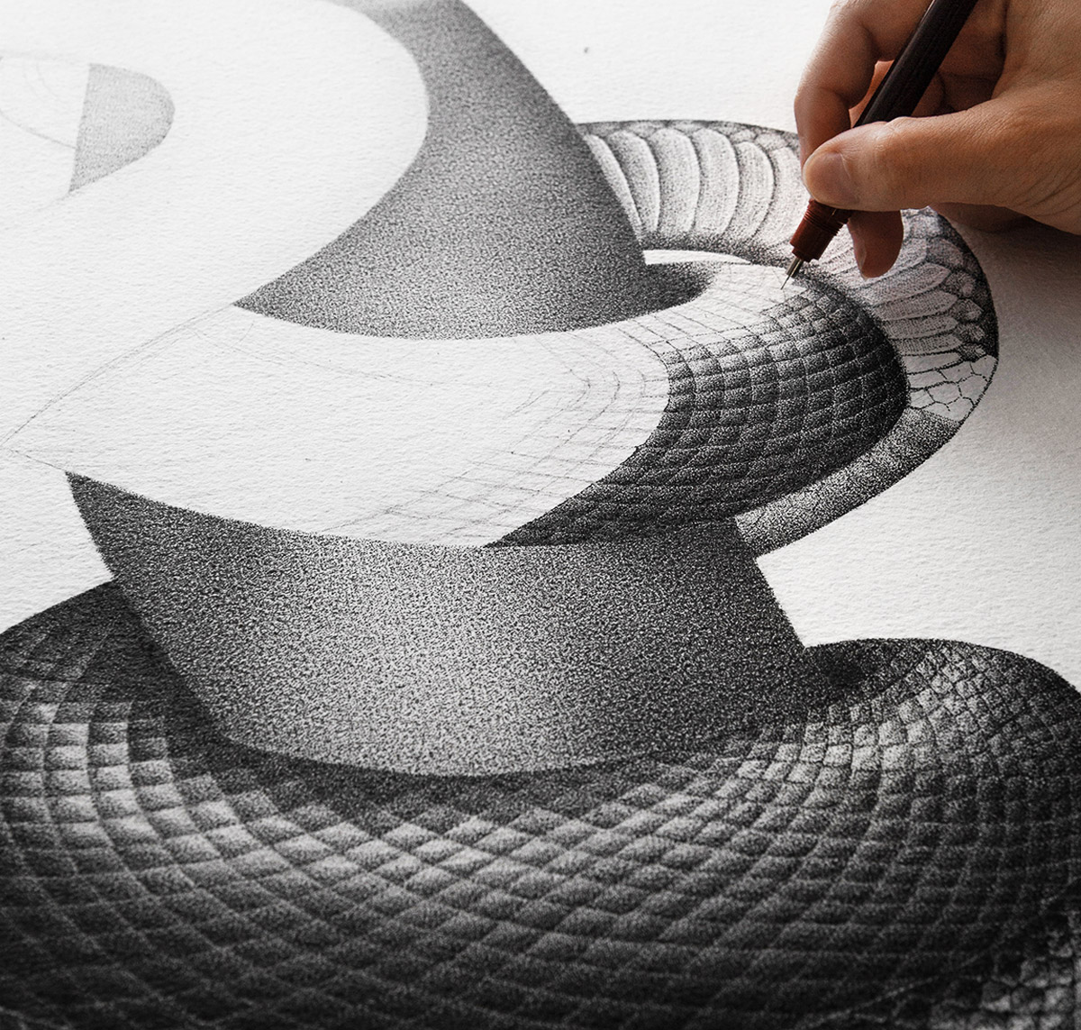
To create my artwork, I use a Rotring Rapidograph 0.1 mm, a technical pen with cartridge-based ink. The replaceable cartridges make it very practical to work with. The pen features a durable body and a chrome-plated nib. In addition to the 0.1 mm nib that I personally use, a range of other nib sizes is available to suit individual preferences. By using the finest nib Rotring Rapidograph offers, I am also able to enhance the level of realism in my work.
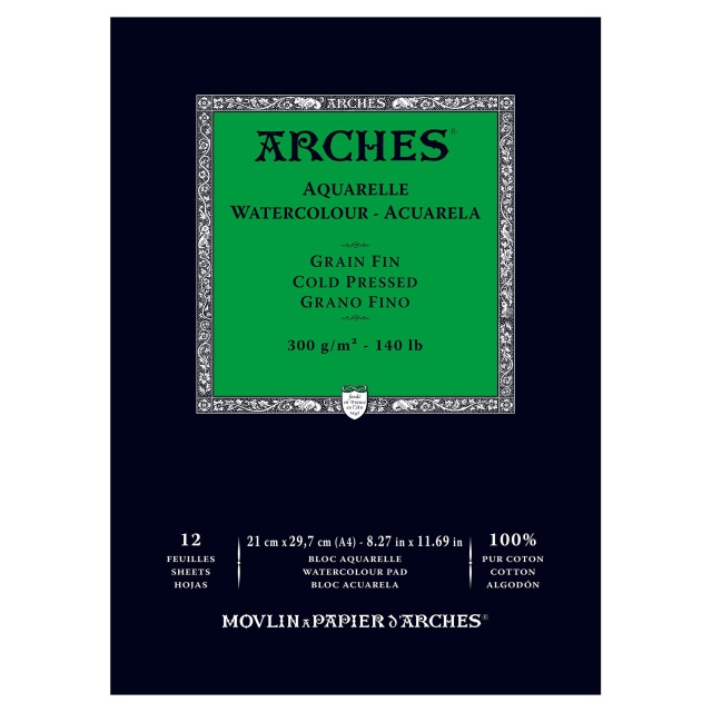
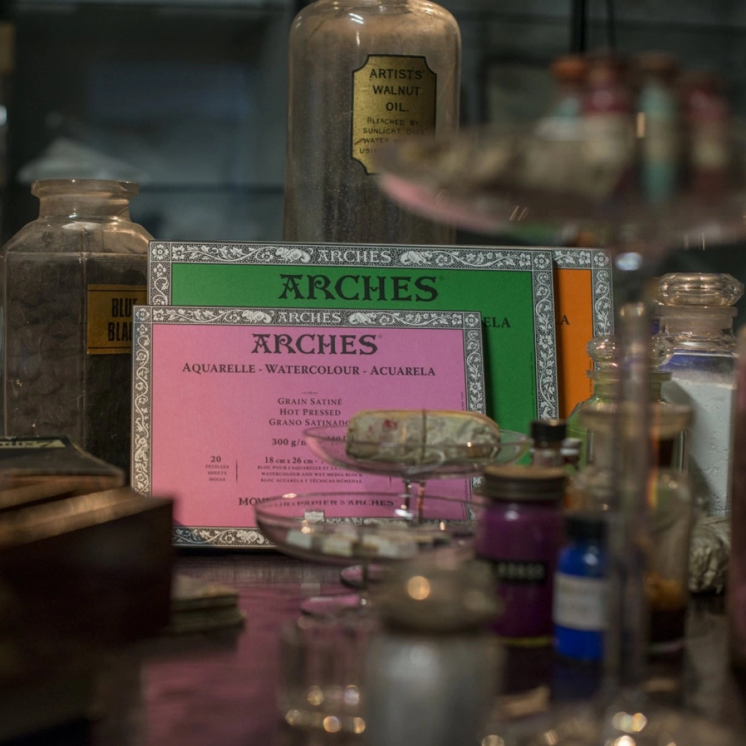
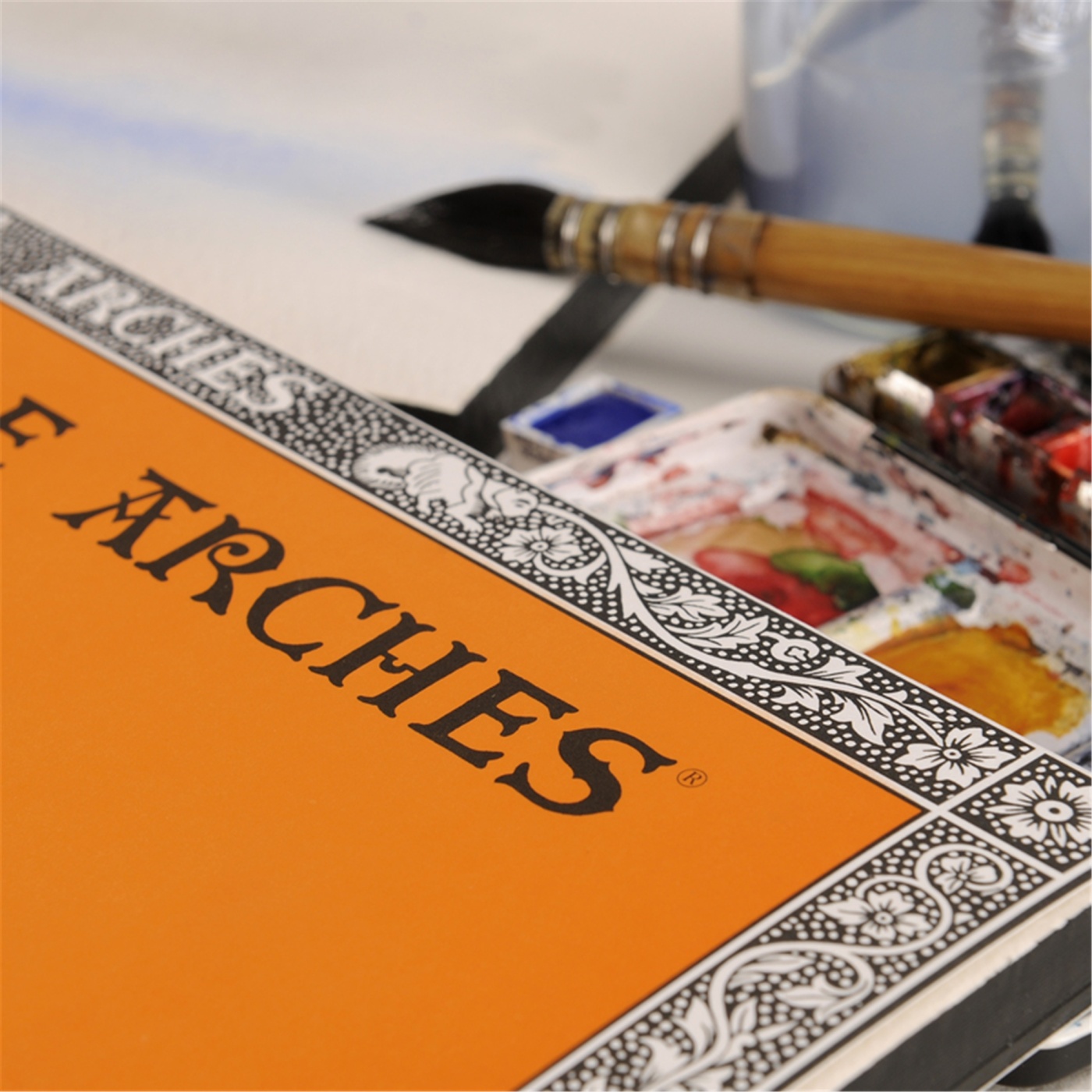
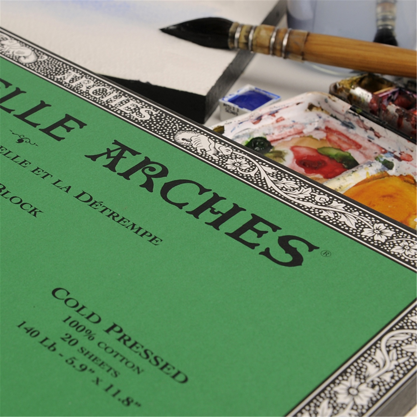
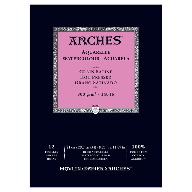
When it comes to choosing a surface for stippling, the possibilities are virtually endless. I draw on paper from Arches, a very thick cotton paper with plenty of texture. Arches offers a variety of paper weights and surface finishes. In my work, I strive for realism, but also a certain softness, and I find that the dots blend beautifully into the surface I am working on. The individual dots become less noticeable unless viewed up close. If, on the other hand, you wish to create illustrations with exceptional precision and sharpness, a smoother paper may be a better choice.
Why have you chosen to work with this technique?
I use the stippling technique to achieve the highest possible degree of realism and the strongest relationship between light and shadow. I find stippling to be a fascinating concept because, instead of drawing something like a circle with a single movement, you create it by placing dots and forming the illusion of a circle. The technique allows the viewer to fill in the gaps and construct a complete image of the artwork. The greater the distance from which the piece is viewed, the more realistic it appears. In some cases, the individual dots are not even perceptible unless you look closely.
What is your process when creating a piece, step by step?
There are several ways to approach creating a piece using this technique. Once you have a sketch or an idea of what you want to create, you can begin working through it section by section. This is perhaps the easiest way to get started, especially if you also use the grid method. The grid method involves drawing with the help of a grid system to achieve accurate proportions.
When creating my artwork, I usually begin by identifying the lightest area of the drawing, known as negative space, an area within a larger form. In stippling, most effects are created depending on how much negative space you leave. The more dots you use and the more closely together they are placed, the more you reduce the contrast in your work. When you use fewer dots, meaning a greater amount of negative space, that area will appear lighter and more prominent.
I place my dots in rows and layers. I typically position the dots in two columns at a time until the entire area I am working on is covered with a layer of dots. For the very lightest areas, I usually apply around two to three layers. I then continue building up additional dots to create the darker sections. The more layers you add, the darker the illustration becomes. The process is slow and methodical, but I personally find that it provides greater control over the development of the artwork, while also producing a very even and smooth surface.
What is your best tip for success?
When creating texture with stippling, it is important to identify where the light falls on the object you are drawing. Texture is created by defining the negative space with additional dots, creating the illusion of shadow. A drawing with more dots and less negative space is often perceived as having a greater degree of texture. If you are drawing a landscape or creating perspective in your artwork, it can be helpful to remember that elements intended to appear closer to the viewer should be rendered with greater sharpness than those meant to recede into the background.
Julia Koceva

Fineliners →
Paper →
Sketching Pencils →