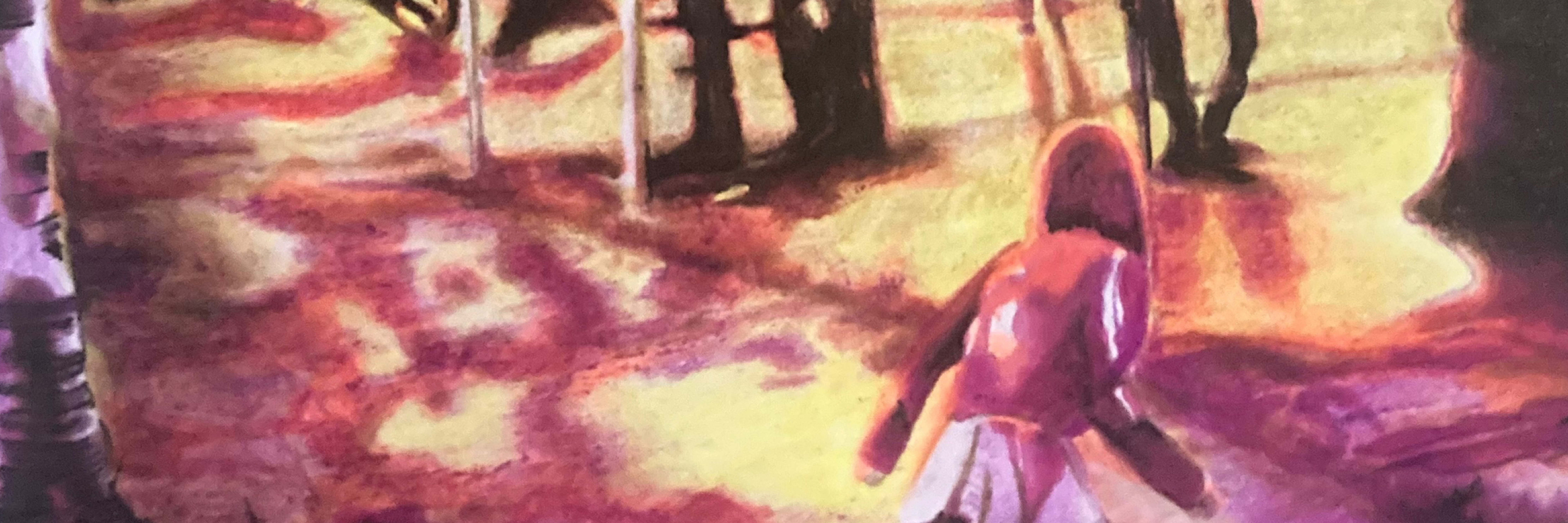
"September" by Åsa Maria Hellman
Winner of Pen Store Talents 2024!
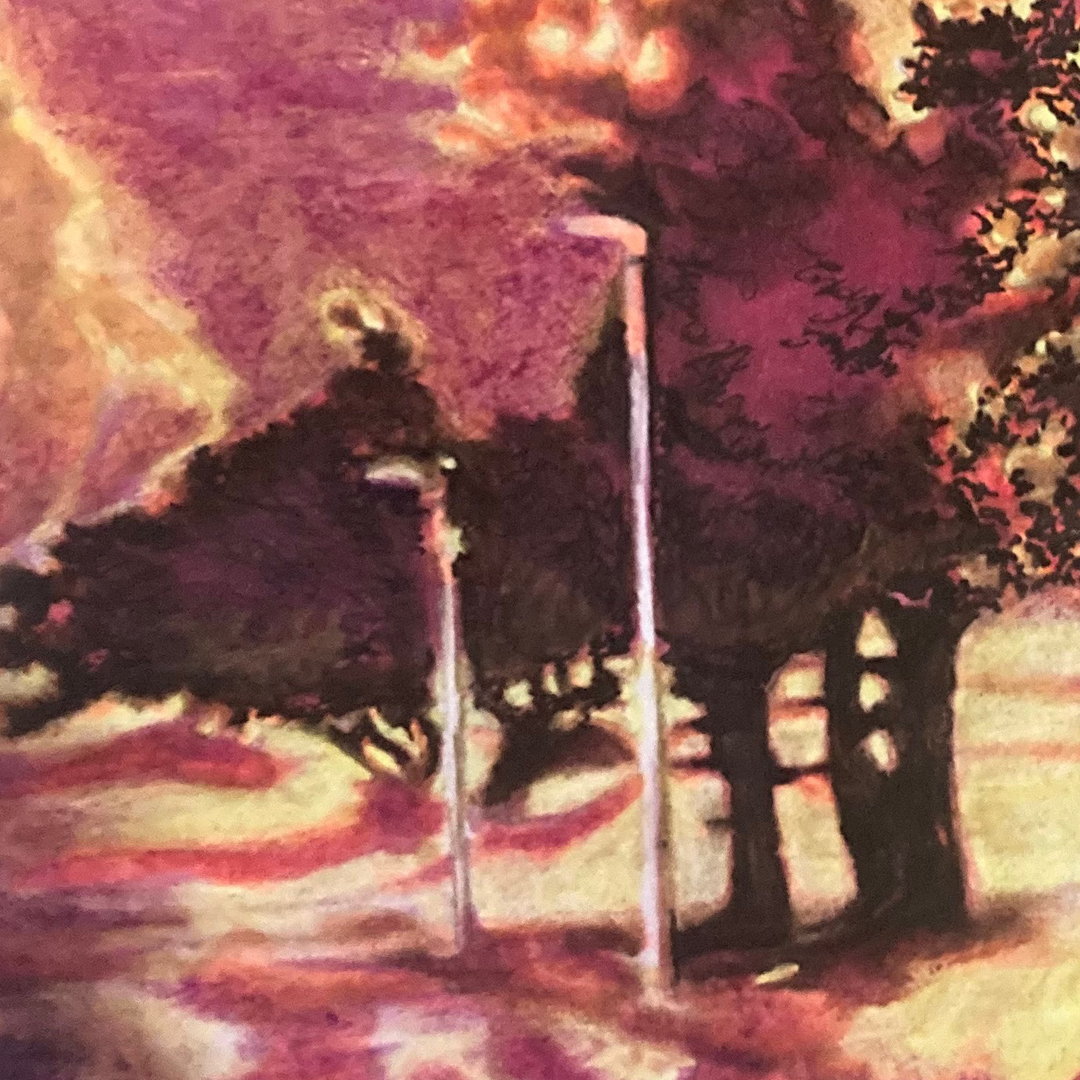
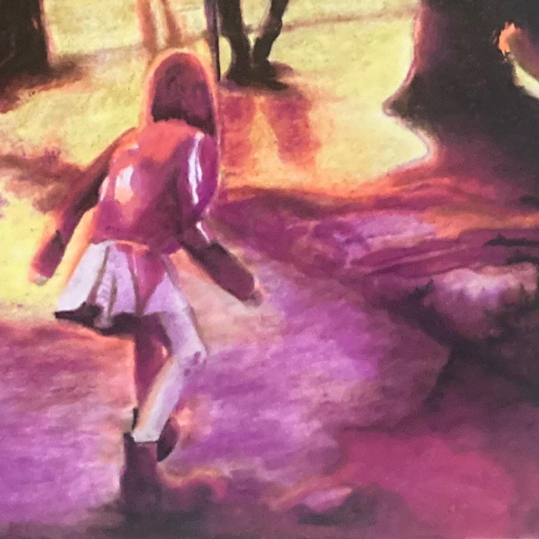
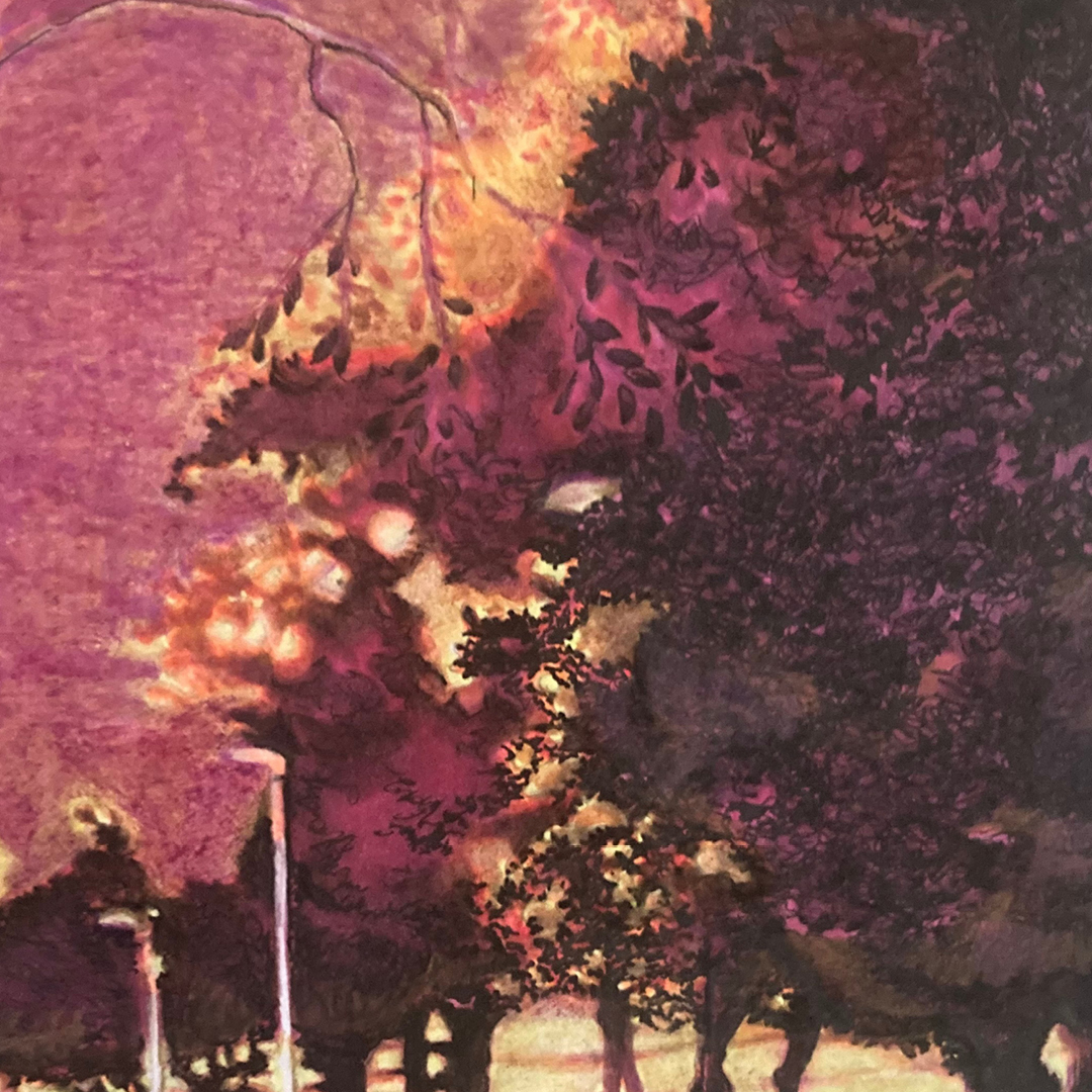
Among over 3,000 entries submitted to this year's competition, Åsa Maria secured the first prize. Her creative and innovative use of all the pens in the kit has resulted in a piece that is both technically masterful and emotionally powerful. With a striking composition and impressive depth, we are drawn into the image and left with questions that spark the imagination: Where is the girl headed? Will she dare to take the step into the picture, or is she on her way out of it? In this interview with Åsa Maria, we ask all the questions we’re curious about. What inspired the artwork, and what was her initial reaction when she received the six randomly selected pens?


Hi Åsa! Tell us a bit about yourself and how you discovered the competition.
I live in Kristianstad with my family. As a child and teenager, I read, wrote, and drew with unreserved joy. There were no cultural interests in my family, but I was left alone and gravitated toward anything different. I attended my first art school when I was sixteen, followed by more art and craft courses as well as studies in art, literature, and creative writing at university. Many people say their personal creativity takes a back seat when they start a family — everyday life and fatigue get in the way. For me, that unreserved joy of writing and drawing disappeared somewhere between art school and university.
That didn’t bother me too much, as I’ve spent nearly my entire adult life working with culture and the creativity of others. I’ve been passionate about culture, art, and unconventional art — not because I think the incomprehensible is better, but because I appreciate the different, much like some people are gourmands. Then came some challenging years. When things were at their darkest, I started drawing and writing again. It wasn’t something I planned; there were no therapeutic reasons or self-improvement goals. It was more like finding a forgotten sweater and thinking, “Oh, right, this is really comfortable.” Now, if I have a moment of free time, there’s nothing I’d rather do than put pen to paper. It’s the most fun I know.
What was your reaction when you saw the pens, and how did you get to know them?
First, you need to know that I’m a materials geek and a bookworm. I take the tactile experience of pen and paper very seriously. My reaction was more like an analytical overachiever than a creative free spirit. I was excited to find a marker from Talens Pantone and the Chromaflow coloured pencil from Derwent. Both were on my “must-try” list. I was relieved to see a fineliner and pleasantly surprised by the number of brush tips. Four of the six pens were from Japanese brands, but I’ll refrain from writing an essay about Japanese pen companies. I understand this isn’t the right forum, but it gives you an idea of how little encouragement I need to drag someone into the same rabbit hole.
In summary, the pens were roughly what I expected, but I hadn’t anticipated such a limited colour palette. I thought there might be a contrasting colour to the warm palette, but the only hint of blueness was in the two pink pens. This wasn’t a disappointment; rather, it motivated me to explore what I could do with it.
0,5 svart
Copy RetryYellow
0930 Hollywood Pink
Orange
992 neutral sandbeige
218 rosa
Can you tell us a bit about your piece and the thought behind the subject?
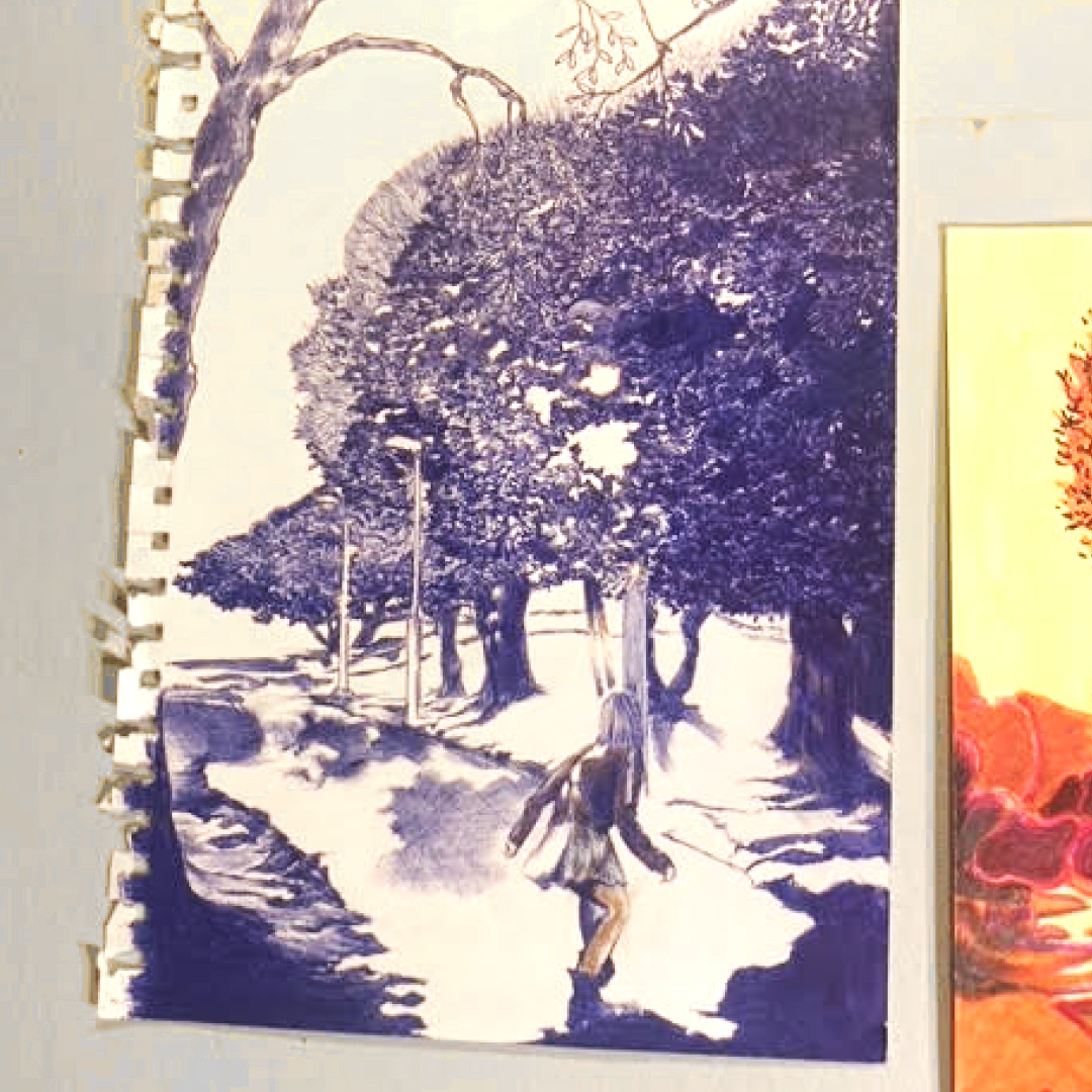
The subject revealed itself through the colours of the pens. I immediately knew I wanted to draw an image based on a photo I took of my daughter one September evening a few years ago. Earlier that day, we had been shopping for autumn shoes, and she had chosen a pair of sturdy boots that gleamed like a freshly brushed pony in the evening light. I believe that art — in the broadest sense of the word — emerges in the transition between the familiar and the unknown. I often start from photographs, and the great joy lies in working until I’ve created something through drawing that wasn’t present in the original image.
What did your creative process look like?
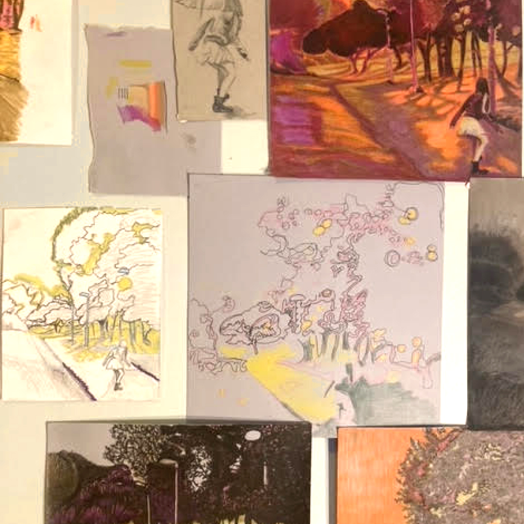
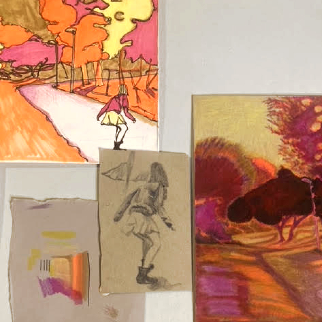
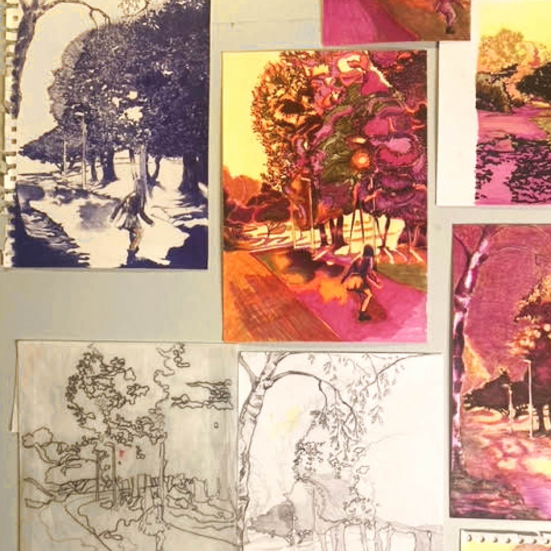
When I was young, lazy, and impatient, I rarely, if ever, made sketches or studies. I’d dive straight into what was meant to be the final result and thought of the “artistic process” as a kind of natural force that either occurred — resulting in a good piece — or didn’t, resulting in a bad one. Why redo something when you can make something new? Artistic quality could be compensated with charisma and a good frame. Now that I’ve matured, I’ve compiled a list for my younger self with reasons why it’s advisable to make plenty of sketches. As it happens, it also describes my current creative process.
Reasons to Make Plenty of Sketches
- Because the drawing doesn’t transfer through telepathy; there are numerous neurological processes, nerves, muscles, blood flow, and motor skills (to name a few) that must cooperate before the sketch starts to resemble what you envisioned.
- Because the result won’t be what you imagined. You can’t know what you think you know until it’s done.
- To get what you’re drawing to “settle into your hand.” Repetition trumps erasers, and repetition infuses the lines with life.
- To focus calmly on individual parts without worrying about the whole.
- Because it’s rarely obvious which format or paper suits best.
- To build a relationship with the pens. Their personality isn’t set in stone. They can look and behave differently when given the freedom to mingle with various materials and surfaces.
- Because it’s more fun to be in the middle of something than to finish something.
For those interested in the technical details, the drawing was made on Crevide’s Bristol paper. The subject was faintly sketched with the coloured pencil from Derwent, followed by the pen from Tombow. One reason for being sparing with the coloured pencil was that I found the wax prevented the other water-based pens from blending well. The drawing was built up layer by layer, from light to dark, except for the Chromaflow, which was added last due to its high wax content. The most versatile pen was the Tombow, which allowed me to create depth or soften values, make certain pens wetter or more fluid, and achieve smoother transitions.
What was the biggest challenge of the competition?
The greatest challenge turned out to be sharpening the Chromaflow colored pencil from Derwent. The tip kept breaking regardless of the sharpener I used or how sharp the blade was. I prefer long points, but I had to settle for shorter ones, which also dulled faster than I would have liked. To maintain the point, I used sandpaper between sharpenings.
Do you have any tips for getting out of a creative slump?
It all depends on the slump, how long it’s lasted, and whether you even need to get out of it. A general piece of advice is to treat your creative drive with gentleness. It’s a light that sometimes needs a cover — both from the world and your own ambitions. My approach is to not do anything about my slumps. This works for me because neither my identity nor my income is tied to the need to create. But what kind of advice is that? One thing you can try is to experience without judgment. For instance, you could watch a movie, read a book, enjoy a meal, or scroll without thinking about what you like or dislike. It’s not a guaranteed way to spark creativity, but the outcomes are often more unpredictable after some time.
Are there any pens you particularly liked and will use again?
I haven’t given up hope on Derwent’s Chromaflow; maybe I got a faulty one? I also liked the marker from Royal Talens. In terms of quality, I didn’t find it significantly different from other markers in the same price range. My guess is that the price is partly influenced by the licensing agreement with Pantone. Pantone is both a company and a color system, which is useful if you want to transfer your artwork to another material. Another advantage is that Pantone colors can be converted to NCS, making it easy to find the color code. Additionally, the refill comes in bottles and can be used like any liquid paint.
What will you buy with the prize money? Do you have any favorite products to recommend?
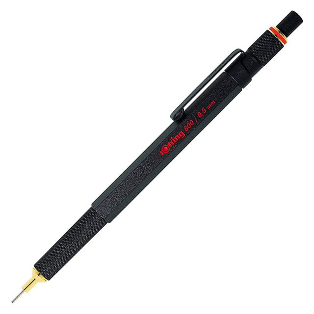
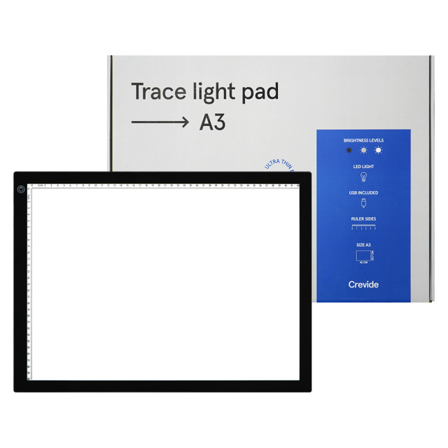
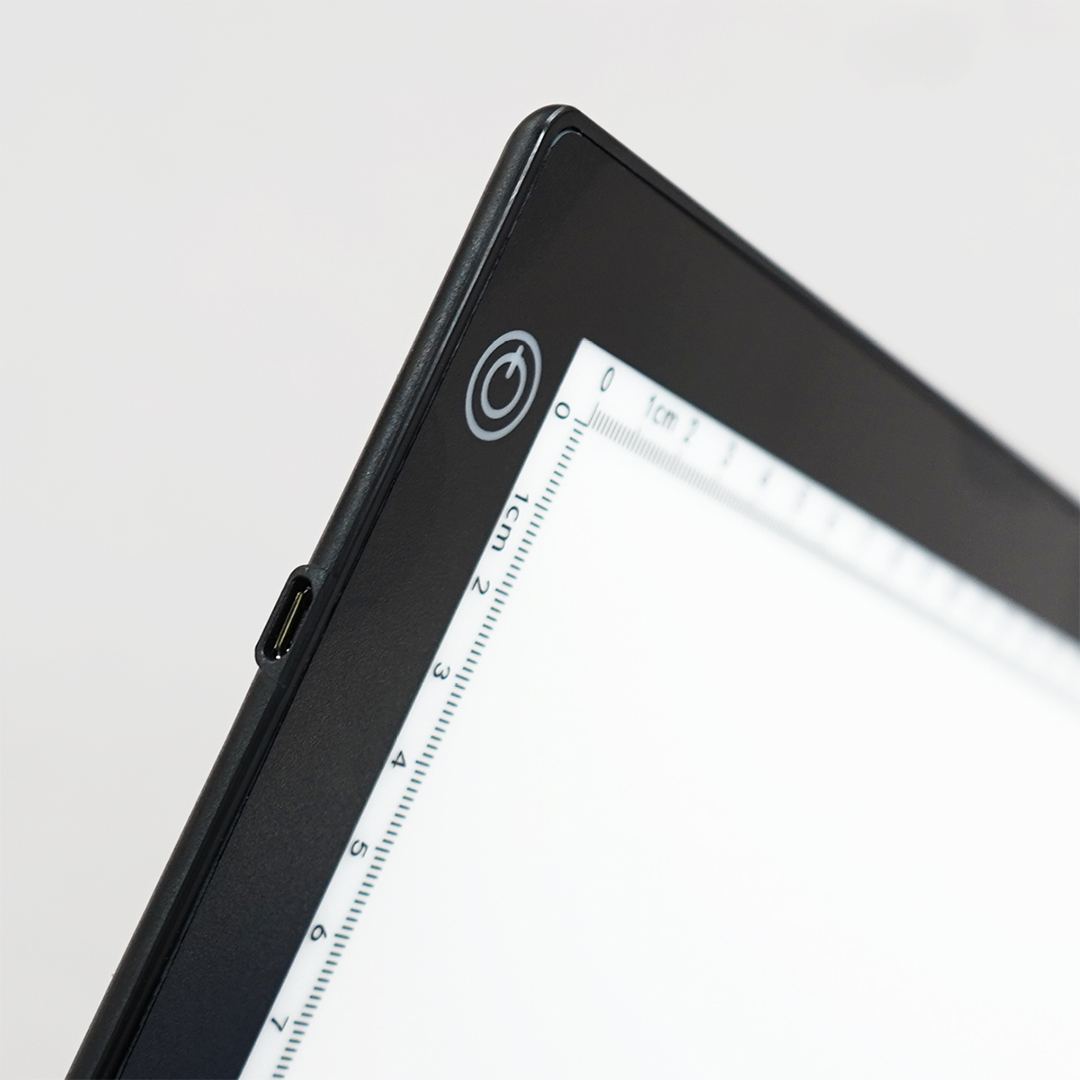
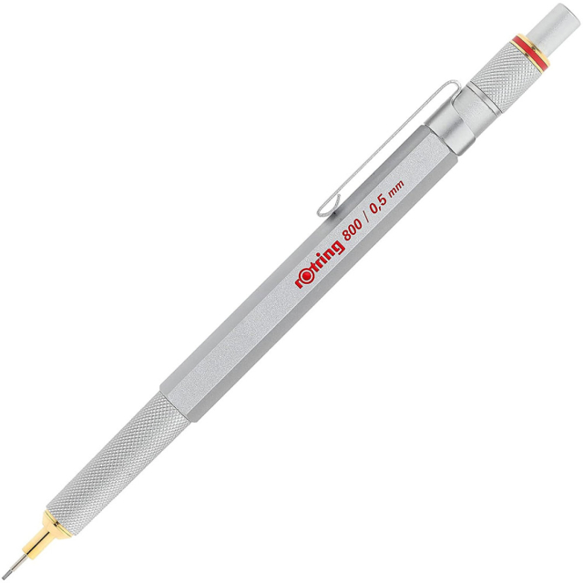
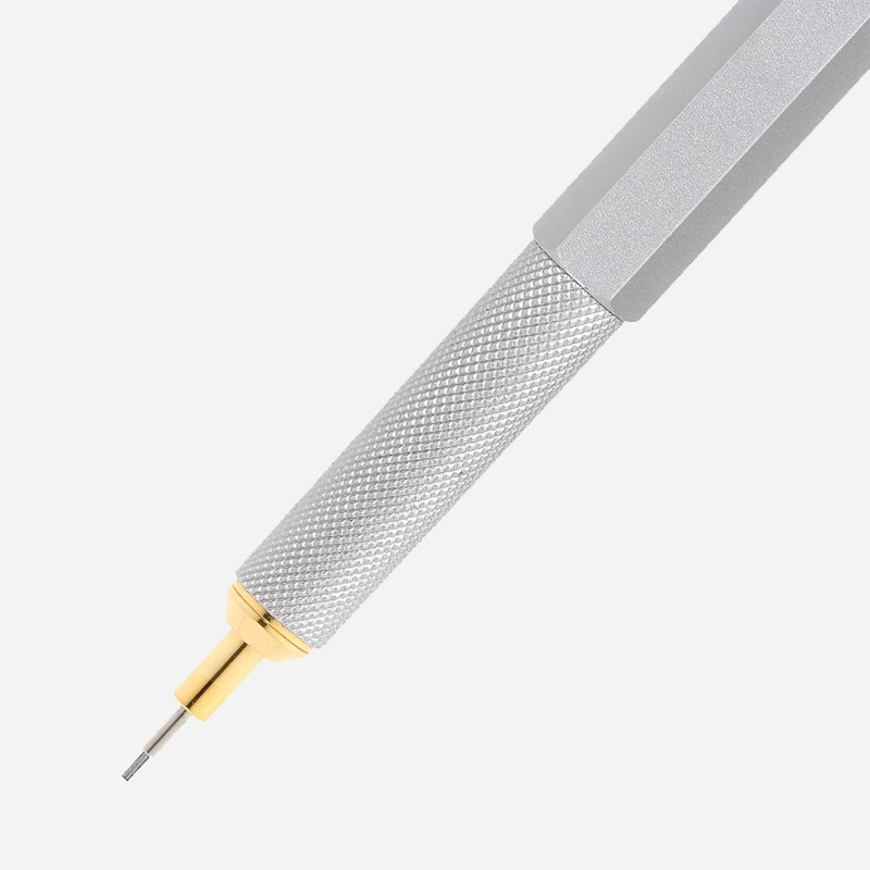
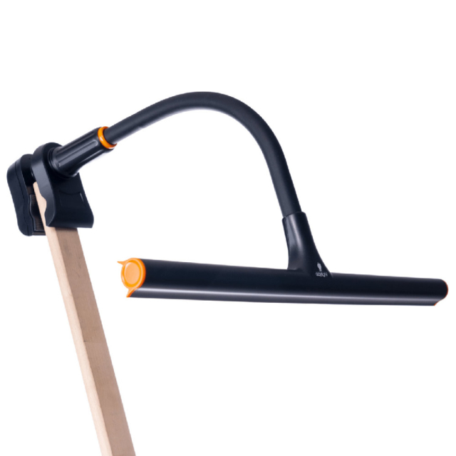
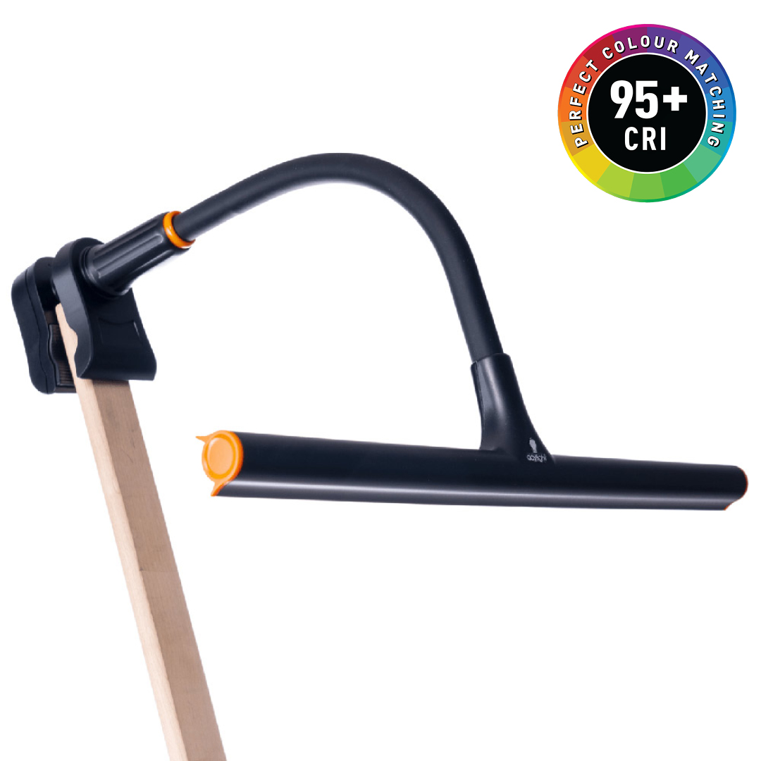
What I’ve wanted for a long time is a proper light table and a set of sturdy work lamps. To be honest, I’m still overwhelmed by the prize. My obsession with art supplies might stem from the joy of discovery, but I’ve prided myself on knowing that the most expensive option isn’t always the best. It may sound silly, but finding a great pen is a small joy in life. Much respect to my trusty BIC Cristal, but now I can try Rotring. Who knows? Maybe I’ll feel inspired to share my findings on Instagram.
@asamariahellman
 United Kingdom (GBP)